Banknotes Insights
Designing for a Kingdom by the Sea
Inside Denmark’s New Banknote Design Studio
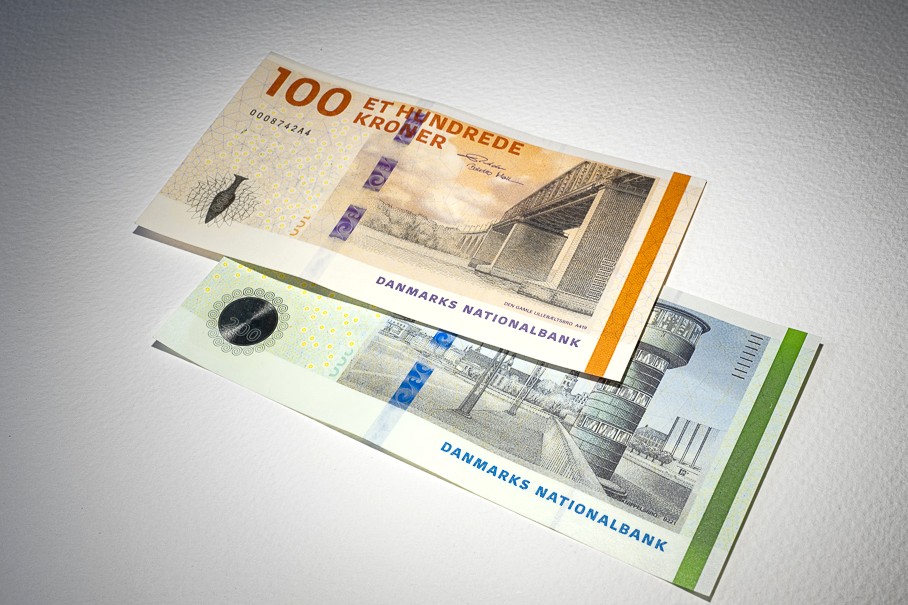
When Danmarks Nationalbank decided to create an entirely new banknote series, the headlines quite naturally focused on security, cash strategy and timelines. Deep inside the Bank, however, another story was quietly taking shape – one built in pencil strokes, color swatches and thousands of design decisions, large and small.
At the center of that story is Head of Design, Jeanette Skov Jensen. Her task sounds straightforward on paper: turn a national narrative – great achievements and the people behind them, and the Danes’ relationship with the sea – into banknotes that will sit in millions of wallets in Denmark and Greenland.
From Visual Identity to National Icons
Jeanette has spent most of her professional life inside the world of graphic design. Since her early twenties she has worked with shaping visual identities at design agencies in Denmark, helping organizations express who they are through type, color and form. Advertising never particularly appealed to her. Design did.
“I’ve always been drawn to how things look and how they are put together,” she reflects.
As a young graphic design student in Copenhagen, she found herself absorbed by typography, detail and structure – elements that now sit at the heart of her work.
When she joined Danmarks Nationalbank in December 2013 the current Danish banknote series (2009) was still quite new so at the time the job was primarily about the Bank’s own visual identity, e.g. logos, publications, digital presence and overall brand expression. Today, her remit stretches from the Bank’s corporate design to Danish coins – and now, one of the most publicly visible design projects in the country, a completely new banknote series.
Turning 150 Ideas into One Coherent Story
The work on the new banknotes did not begin with sketches, but with listening. In the early phase, Danmarks Nationalbank invited museums, universities and cultural institutions to submit ideas for themes and motifs for the new series. The response was overwhelming when loads of proposals landed on the Bank’s desk.
Those proposals, combined with input from a broad citizen survey, were evaluated by an expert group that included external specialists and representatives from Danmarks Nationalbank. From this material, Jeanette and her colleagues distilled a single overarching concept.
“The task was to convert all of that input into one clear story that could live across four banknotes,” she explains. “You need something that is rich enough to carry a lot of detail, but simple enough for people to understand at a glance.”
The result is a narrative that celebrates great achievements and the people behind them on the front of the notes, while the reverse focuses on the sea. In between those two poles – human achievement and the surrounding ocean – sits a complete visual system that must work in every denomination.
“We moved from a long list of potential people and ideas down to four main stories,” Jeanette says. “Each note has its own universe, but they all belong to the same family.”

The Sea as a Unifying Motif
If you grow up in Denmark or Greenland, the sea is never far away. It shapes trade routes, holidays, everyday language and even the weather forecast. For Jeanette and the banknote team, it also became the element that visually ties the series together.
“The sea is both practical and poetic,” she says. “It is part of our shared history, but also part of our future with things like sustainable energy and biodiversity. Visually, it gives us movement, depth and texture to work with on the reverse of the notes.”
On the front, the focus is on individuals and their achievements – people whose work reaches from the Earth’s inner core to outer space, from Arctic exploration to stories that have travelled across generations. The portraits, the achievements and the surrounding details need to be recognizable but not overloaded.
“A banknote is not minimalist,” Jeanette points out. “There is simply too much information that needs to be there – legal text, numerals, signatures, security elements. The challenge is to make it feel simple and powerful despite that.”
That idea of “simple but punchy” became a guiding principle. Compared to today’s Danish banknotes, which are relatively subdued in their color palette, the new series will be noticeably more vibrant. The colors are not only aesthetic choices – they also support security, accessibility and public recognition.
“We wanted each denomination to be instantly distinguishable,” she says. “Color is one of the most intuitive tools we have for that.”
Standing Out in a World of Lookalike Banknotes
Look at recent banknote series around the world and certain trends start to appear with similar color harmonies, similar ways of treating portraits, similar abstract patterns. Jeanette is very aware of the global visual trends – and equally determined that Denmark’s new notes should not simply blend into it.
“Contemporary banknotes often look alike,” she says. “We wanted to make sure that ours feel Danish, even at a quick glance.”
Part of that comes from the choice of motifs and stories. Part of it comes from how the illustrations are created. For this series, the Bank has commissioned two artists to translate the design concept into detailed drawings.
“The job is to build the overall look and feel,” Jeanette explains. “The artists then take those building blocks and add their own hand. You can see that both in the intaglio print on the front of the notes, but also in the offset print on the reverse of the notes where the story of the sea is told. Their line and their touch become a part of the story we are telling.”
The result is a design that is not minimalist in the strict sense, but visually clear. A limited number of strong elements, carefully composed, with room for texture and detail where it matters most – and with a distinctly Danish expression.
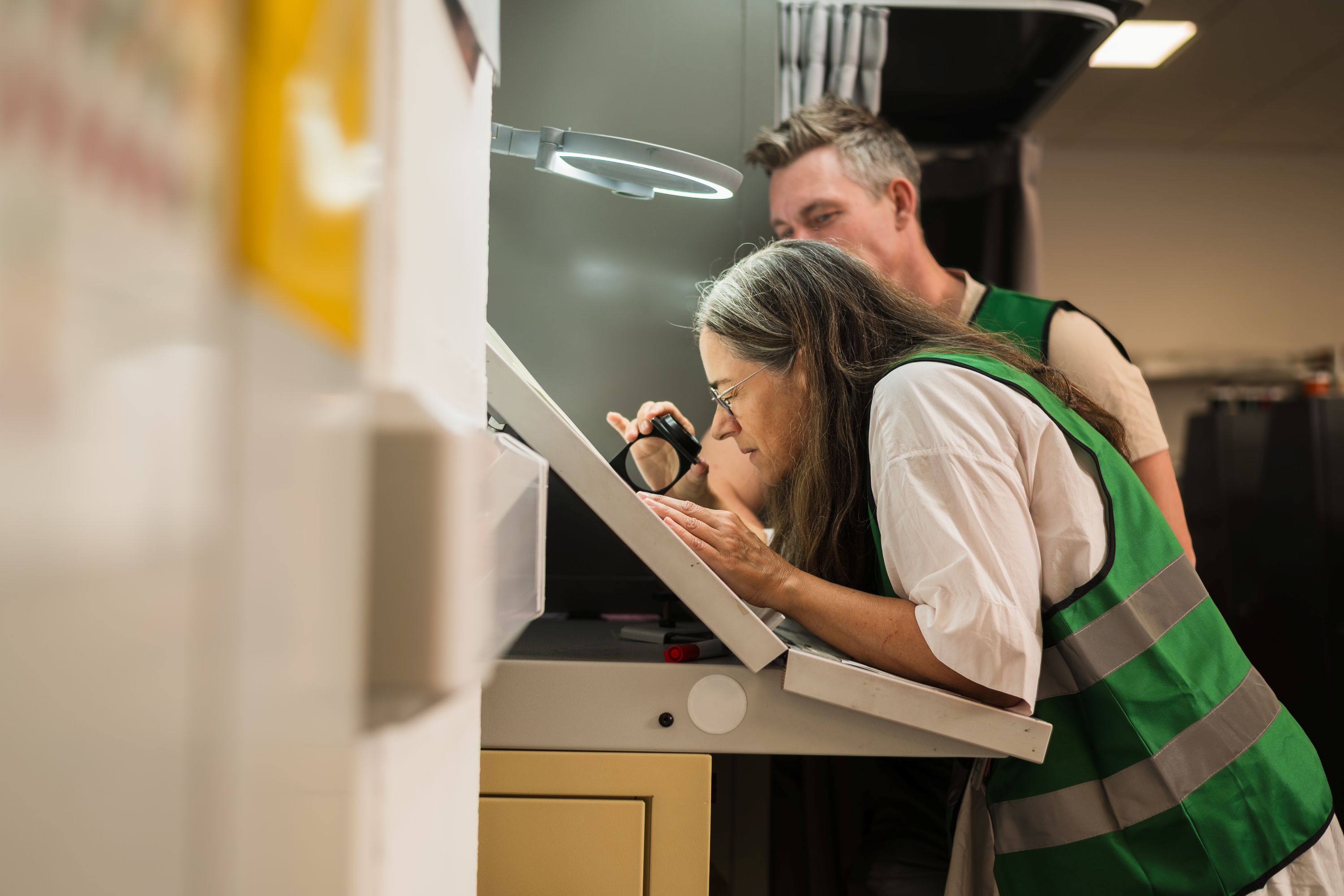
When Art Meets Micro‑Optics
In design school, students learn about composition, typography and visual hierarchy. In banknote design, you add a completely different curriculum on top with intaglio plates, register tolerances, watermark, window thread and perhaps holograms.
“Banknote design is also a technical discipline,” Jeanette says. “You only really understand that once you are in the middle of the process.”
From the outset, the Bank decided that the new series should combine a strong visual concept with cutting‑edge security features.
Applied security features must be integrated from the very first sketches. They must align with the visual story, stand out clearly for the public and behave predictably in production.
“You are always designing for two audiences at once,” Jeanette explains. “For the person who has half a second at a checkout counter, and for the machines that sort millions of notes. Both must be able to authenticate the banknote quickly.”
Collaboration at the Heart of the Project
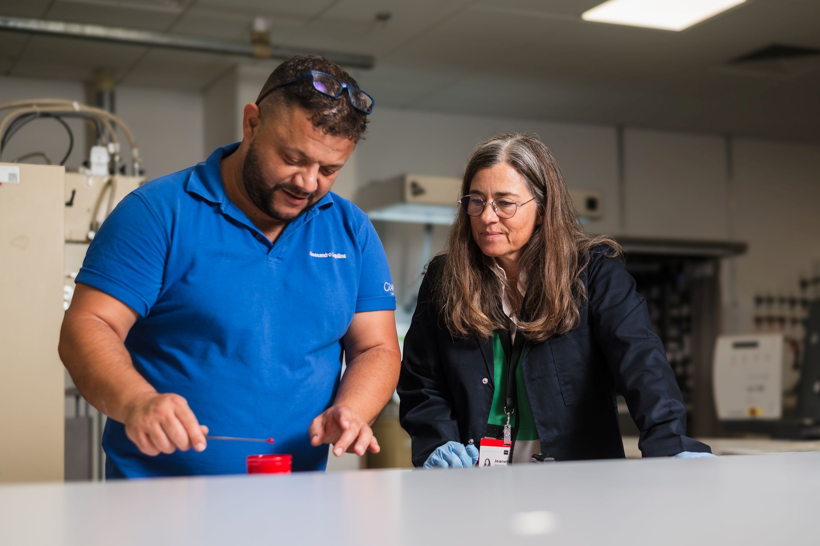
That means close collaboration with Crane’s design and security experts, and ultimately with the printing works awarded the contract to produce the notes. Jeanette and the colleagues from Danmarks Nationalbank has spent many hours with the Design Team in Tumba, turning abstract design ideas into concrete engraving lines, color separations and micro-structures.
“We really value the partnership with Crane,” she notes. “Their designers and security experts understand both the artistic and technical side. We can challenge each other creatively and still end up with something that works perfectly in production.”
“We start with a fairly open visual universe,” she says. “Then, together with Crane and our technical colleagues, we gradually shape it into something that can actually be printed millions of times – with the same quality every time.”
Waiting for the Reveal
The final appearance of Denmark’s new banknotes will remain under wraps until the Bank officially presents them. The first notes are expected to enter circulation in 2028, with the remaining denominations following afterwards. Until then, the design work continues behind the scenes: refining lines, adjusting colors, testing security elements and making sure that the series performs just as well in a cash center as it does in someone’s hand.
What can be said today is that the 2028 series will bring together a clear narrative, a distinct Danish visual expression and some of the most advanced security features available.
For Jeanette Skov Jensen, the measure of success will be simple:
“If people can recognize the stories, trust the notes and feel that they belong to them,” she says, “then we have done our job.”